UC Berkeley rebranding: Cal Berkeley dies, B is for Berkeley (why?), Cal stays the same
Nothing is really solved, but more is added, and UCLA gets some revenge.
It has been an issue as old as time. There is Berkeley the city, there is UC Berkeley the university, and there is Cal, the athletic program.
Over time, UC Berkeley has blended into Berkeley, the brand most well-renowned for our beloved alma mater. Cal has stood to the side, and remained mostly on the periphery. This has led to general confusion around the nation about whether Cal and Berkeley are the same university, to the detriment of our athletic brand and perhaps our standing among the major collegiate programs.
After a task force made an attempt to try and unify the athletic and academic brands together under the infamous name Cal Berkeley, that initiative has been scrapped.
Instead, almost nothing has happened, and what has happened is very odd.
After reviewing these and other research findings, the Berkeley/Cal Identity Task Force made several recommendations to enhance clarity, elevate community and communicate the breadth of the campus’ offerings and comprehensive excellence.
In response to the task force’s recommendations, the campus undertook a project to update the Berkeley and Cal brand identity. While the recommendation to shift the athletics identity to Cal Berkeley will not be adopted, the other changes recommended by the task force are reflected in this visual identity update.
…
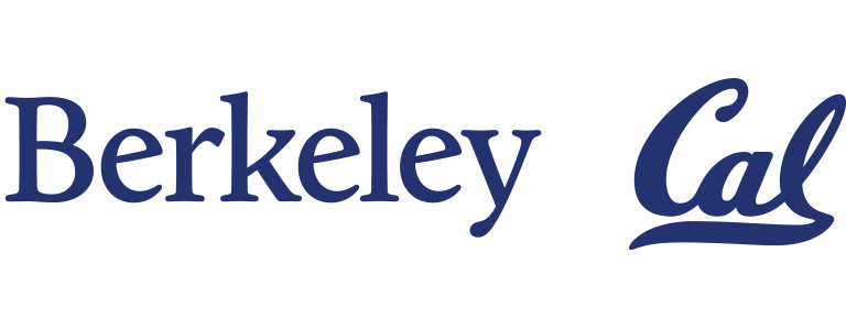
The Cal logo is unchanged, preserving its rich history and tradition. The Berkeley logo is being updated to address issues with legibility at small sizes, usability in digital environments, and incompatibility between the two logos while maintaining the equity built over generations.
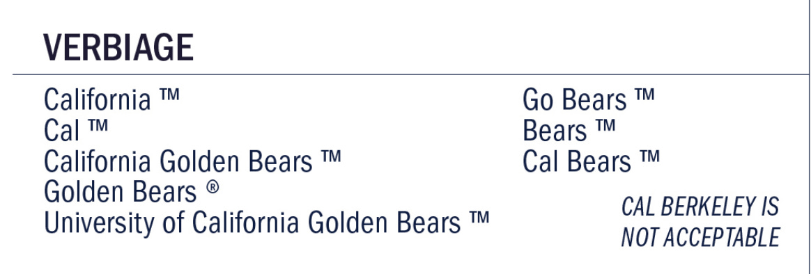
So in short, nothing much is changing on the athletic side. Cal will stay Cal. Cal Bears, California Golden Bears, California, Go Bears, all are still our preferred names of choice.
But the new Cal Athletics brand guidelines do make it very clear. Cal Berkeley is not on the menu.
On the university side, Berkeley remains the prominent feature on the academic end. There have been some typeface updates apparently.
The new Berkeley logo draws inspiration from the original metal version of the typeface and other Goudy works. It retains the visual equity of the existing logo while functioning as a believable system with the Cal logo.
Here’s what it looks like (Cal is unchanged).
But there is one major update on the social ends. The new symbol of Berkeley is a monogram of the letter B. More from the San Francisco Chronicle.
A yellow letter “B” in a serif font, surrounded by a blue background, is part of the university’s rebranding, the first since 2013, Patrick Holmes, executive director of communications and marketing, told SFGATE
…
The updated “B” is only going to be used in small spaces where it’s hard to see the Berkeley logo, Holmes said, which is simply the word “Berkeley.”
Welcome to the B. You know, that thing that you have never called Berkeley in your life.
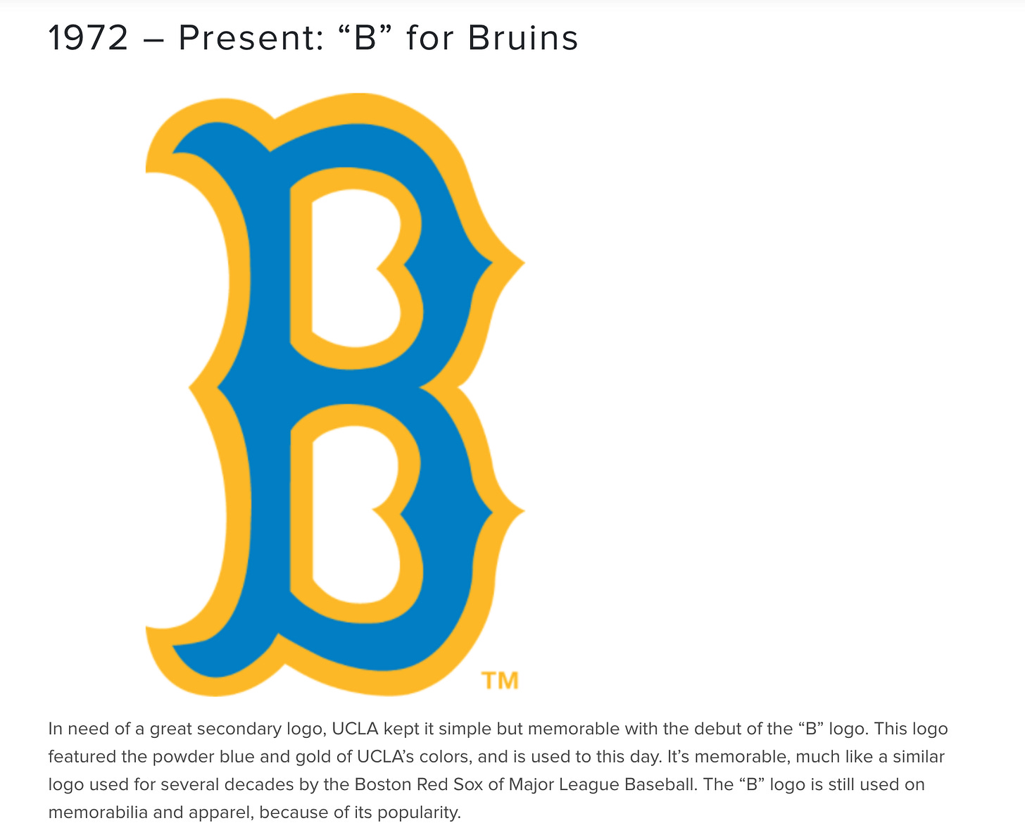
Hmm, gee, where have I seen the B before? Seems familiar.
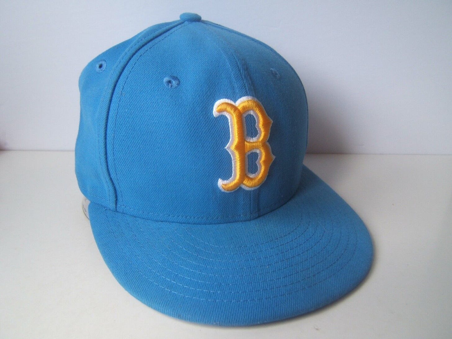
Ah, yes, it’s the current UCLA Athletics secondary logo! That they use on hats, merch, and plenty of spots on the Westwood campus. More details here.
So not only do you have a symbol that no one understands, you also have potential trademark infringement, and if not, just general confusion in the near future as to why UC Berkeley grads are buying UCLA-coded hats.
These are the sort of rebranding things that could’ve been avoided if more athletics people were consulted and brought in the loop.
Instead we get bureaucrats, sweet, beautiful bureaucrats.
This isn’t quite as bad as the UC flushing toilet logo, but it is not great, Bob.
A petition on Change.org has already reached over a thousand signatures to reverse the rebranding.
Bk was the abbreviated symbol for awhile, and it was great! Because that was our chemical element we discovered, and it stood for Berkelium, because it was discovered in Berkeley! Why not just stick to that? All us nerds understood this.
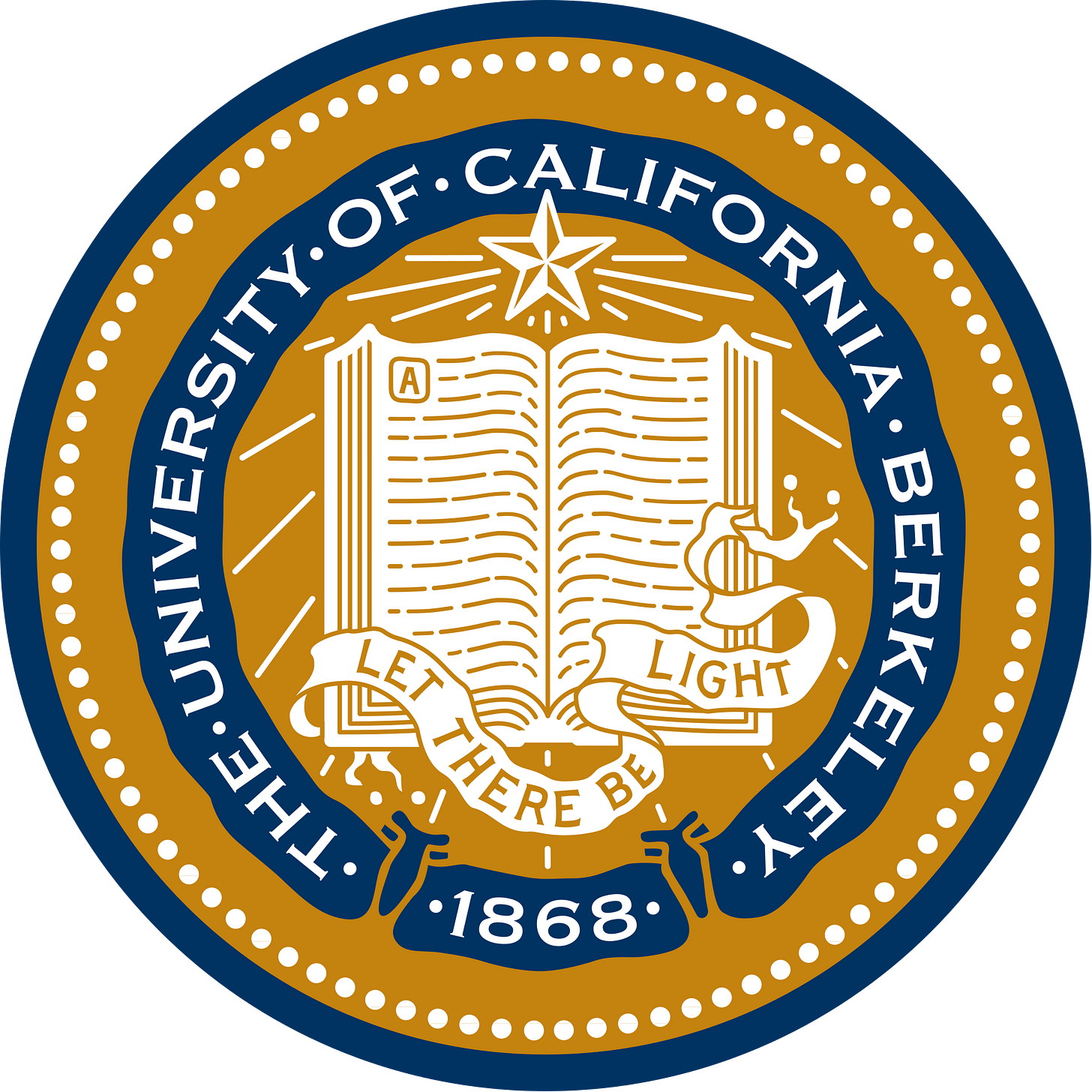
And if anything else, we had our seal. Our beautiful, beloved seal. It conveys almost everything you need to know about the flagship program.
In the meantime, UCLA, congrats on your quick revenge for Calimony!





Lets wait for July 1st. That is when a Golden Bear assumes the Chancellorship. The Good News is, they are not using Cal Berkeley. What a disaster that would be. See my earlier post on the background: https://writeforcalifornia.com/p/cal-uc-berkeley-california-brand-debate/comment/40348579?utm_source=activity_item As for the B. The first thing I thought of was UCLA and/or the Brooklyn Dodgers. Both are bad by their association (Spoiler alert, I am a Giants fan). I loved the Bk (for the reasons described above). Or yes, our original logo (crest), which says University of California. I assume this will go back to Bk. And Cal for sports will stay the same. BTW, For the teams, I still think the entire California should be used. And "C" should be used for social media. Especially as we go to the ACC--where the schools are called Virginia, North Carolina, etc. No time like the present. If and a big If, we can get to the Big 10, their schools also use their full name. Michigan, Wisconsin, Indiana, Minnesota, etc. Go California Golden Bears!
I don't like it. But remember, kids, it can always be worse.
https://99percentinvisible.org/episode/episode-69-the-brief-and-tumultuous-life-of-the-new-uc/