
Weaver, Hawkins, and the 2020 NFL Combine
A quick review of measurable 2020 NFL Combine results

The NFL Combine is the annual event where the presumptive NFL draftees from the college are invited to showcase how well they look in shorts. Daniel Jeremiah, in his recent podcast “Move the Sticks” on the defensive players in the 2020 Combine, remarked that the purpose of measurables is to confirm what was on the scouting tape.
If a prospect were to put on paper a performance that matched their tape, then the scout would move on.
If the player’s data were to deviate from the tape, then the scout would check.
Of course, there are cases where the NFL combine performance can rocket a prospect of the boards due to their sheer athleticism. See Byron Jones (all data courtesy of MockDraftable.com) :

A player who measured in the 99th percentile in all critical measurements for the CB position, his Combine performance helped him rocket up the draft board. Before the combine, he was not even on Daniel Jeremiah’s 1st mock draft. He developed into a top-tier CB with the Cowboys (making the Pro Bowl in 2019) and is predicted to become the highest-paid CB in the NFL in Free Agency.
With Ashtyn Davis’s participation limited due to his recovery from his late-season surgery, let’s take a look at the drills and workouts for the two Golden Bears who were able to participate (Evan Weaver and Jaylinn Hawkins).
Let’s start with the face of the Cal defense in 2019, the undisputed shit-talker, and protector of the culture.
Evan Weaver, ILB/MLB #89 California
If you opened this article, then you know who Evan Weaver is. His play, grit, and post-game interviews are the things of deep California Lore. Entering the combine, he was praised for leadership, production, football IQ, grit, and motor; however, he was knocked for his general athleticism (speed, change of direction, explosiveness), and short arms.
Therefore, Weaver needed to dispel the notion that he had to disguise his lack of physical capacity with smart play and scheme. At least, he had to show that he was average athletically for the position.

We can see that vis-a-vis off-ball ILBs, despite being 23rd percentile in weight, he only had a median 40-yard speed, and 34th in the vertical jump. However, his best performance—the shuttle run, which tests read-react agility laterally—came in the category key for LBs. Furthermore, he showed good performance in the broad jump (sudden explosiveness) and 3-cone drill (change of direction).
What did his measurables indicate vis-a-vis the scouting tape? It confirmed that he isn’t an athletic liability at the ILB position in the NFL. That’s all he needed to do to push back against the narrative that somehow he was a lumbering giant who relied on scheme/football IQ/grit to produce on the field. He is athletically average for the position; looking at the NFL, Weaver’s second-closest comparison per Mockdraftable is Nick Kwiatkowski, who was drafted in 2015 by the Chicago Bears 113th overall and has been the starting ILB for them for the last couple of years.
Jaylinn Hawkins, Strong Safety #6 California
Big Hawk as he is called by the Cal fans, he was pivotal to the first group of #TAKERS that graced Memorial Stadium. He was a WR/DB 4* commit for Cal and ended up protecting Cal’s backside with Ashtyn Davis. Coming into the combine, he was pegged as an aggressive box-safety with ideal size, despite poor athleticism to make plays on the field.
During his combine, he only performed in two measurable competitions: vertical and broad jumps.
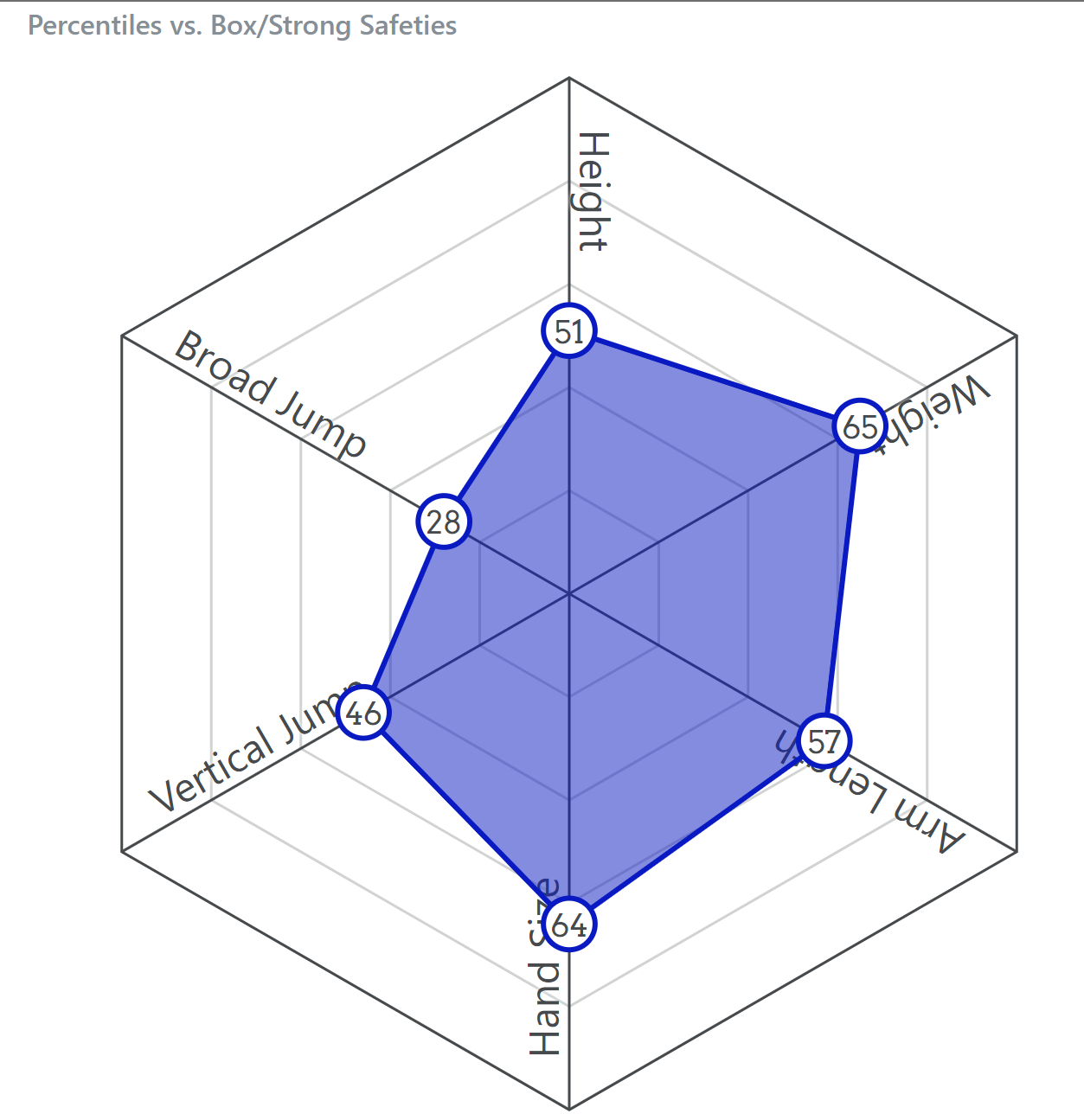
Even when compared to SS/Box Safeties from the database, his vertical and horizontal explosiveness numbers leave much to be desired. His drills in Indy went smoothly; however, he will have to put on some more numbers during the Cal Pro Day. Coincidentally, the same applies to his running mate Ashtyn Davis, who only benched at the Combine. Both of the safeties should add to their numbers while at the Cal Pro Day allowing us to look at similar athletic profiles for their position.
I feel like these visualizations do a poor job at accurately displaying combine performance.
The filling-in of the color makes it seem like area under the curves is what we should be looking at, but often times the area is somewhat arbitrary. Look at Weaver's for example, if you switched his Bench Press and his 40, there would be more area under the curve, just based on which categories are next to one another.
I know they look cool, but a bar chart is probably a lot more honest about the data.
I hope all three of these former Bears get a good look. Both Davis and Weaver will be drafted but Hawkins may be a UFA.