


Welcome back to the new and improved The Good, the Bad, and the Rockfights, our weekly attempt to fit the previous game into a tidy little statistical box. In our previous edition, we were in a bit of an existential crisis because our previous data source had become untenably expensive. Well, we found a new source: introducing, BCF Toys! I’ve been a fan of the site and data guru Brian Fremeau’s work for many, many years (I’ve been following his weekly score projections, with a particular focus on Cal, for as long as I can remember). While our previous PFF data used player-level grades aggregated to the team level to cover performance of specific position groups (run blocking, receiving, pass coverage, etc.), BCF Toys’ data focuses primarily on possessions and the outcomes of those possessions. Here’s how Brian described the origin story for his brand of analysis:
I’m frequently asked questions about the origins of my work with college football data analysis. After witnessing a 2002 victory by Boston College over Notre Dame, a game in which the Eagles failed to advance a single offensive drive across midfield and the Irish had six drives fail inside the BC 25-yard line, I had questions that traditional box scores were unable to sufficiently answer. I began collecting possession data soon thereafter; to define the fluid value of field position, quantify the impact of turnovers and special teams, evaluate offensive and defensive team strengths, and develop new measures of team and unit success. The Fremeau Efficiency Index (FEI) ratings and other possession statistics found on this site are the results of those initial inquiries, and many more since.
His Whiteboard page provides a ton of information and context about his analytic approach (if you’re interested in this stuff—which you might well be because you’re reading this piece—and you have 10-15 minutes to spare, I encourage you to read through the whole thing. But only after you finish reading this piece.). If you don’t have 10-15 minutes, then here’s a very quick explainer:
I’m really only interested in capturing a few key data points with every possession in every FBS game: who had the ball, where on the field did the possession begin, how many scrimmage plays were run on the possession, where did it end, how did it end, and what was the score when it ended. I also record whether the possession took place in the first half, second half, or in overtime.
BCF Toys’ data thus has a very simple focus: how can we quantify aspects of a possession over the course of a game? Moving from PFF’s data to BCF Toys’ data, we’re largely pivoting from player-driven measures aggregated to the team level to measures that strictly capture team-level drive performance. And as you’ll see, there’s some surprising overlap in what comes out of our analysis compared to our previous data.
A Glossary of BCF Toys’ Game Ratings
We have a new data source, so we have several new measures to learn. Fortunately there is conceptual overlap across several of them and they’re fairly straightforward, even if the names can be a bit long.
Offensive and Defensive Ratings
These six measures are captured for offense and defense for each game (note: all measures exclude garbage time possessions, and the bottom of this page explains how garbage time is measured).
Game rating: game-level FEI data capturing scoring value per possession (adjusted for opponent quality)
Possession efficiency: unadjusted scoring value per possession
Points per drive: points scored per drive
Available yards percentage: total yards accumulated (from the beginning of the possession to where the possession ends) divided by the distance to the end zone from the starting position. For example, if a team gets the ball at the 50 and drives to the 35 before stalling out, that would be a 30% rating for the offense and a 70% rating for the defense on that possession.
Yards per play: rather self-explanatory
Drive success rate: percentage of drives that end with a score (TD or FG)
In sum, these ratings capture a mix of yards-based productivity, efficiency in moving the ball, and achieving the ultimate goal: points. I had to calibrate the ratings so that higher scores are better across all categories. A defense that yields more yards per play and points per drive is actually worse, and BCF’s raw data reflects that (so lower scores are better for most defensive ratings). But when we’re looking across offense, defense, and special teams, it’s easier to have consistency when interpreting what higher vs. lower numbers mean for the ratings.
Speaking of special teams, that’s a new addition that we did not have with our previous data. Now we have five special teams ratings:
Game rating: scoring value generated per field goal, punt, kickoff, and PAT (adjusted for opponent quality)
Possession efficiency: unadjusted scoring value per field goal, punt, kickoff, and PAT
Field goal rating: value added per field goal attempt
Punt rating: value added per punt attempt
Kickoff rating: value added per kickoff
With that, we have 17 team-level ratings for each game. And our goal is to make sense of what those ratings tell us about the team’s overall performance. To derive some insight from those ratings, we use the same approach we’ve been using throughout this series: a machine-learning clustering algorithm (a k-means clustering algorithm, which you can read more about here).
With that long re-introduction to the series out of the way, we can dive into data from the UCLA game.
Ratings Comparison
It’s a Good-Bad-Rockfights post, so you know there will be boxplots. With 17 distinct ratings categories, a single plot would be too crowded, so I am now breaking them up into plots for offense, defense, and special teams.
Offense
Recall that boxplots capture the distribution of the data, where the box represents data between the 25th and 75th percentiles, and the horizontal line represents the median or midpoint of the data.
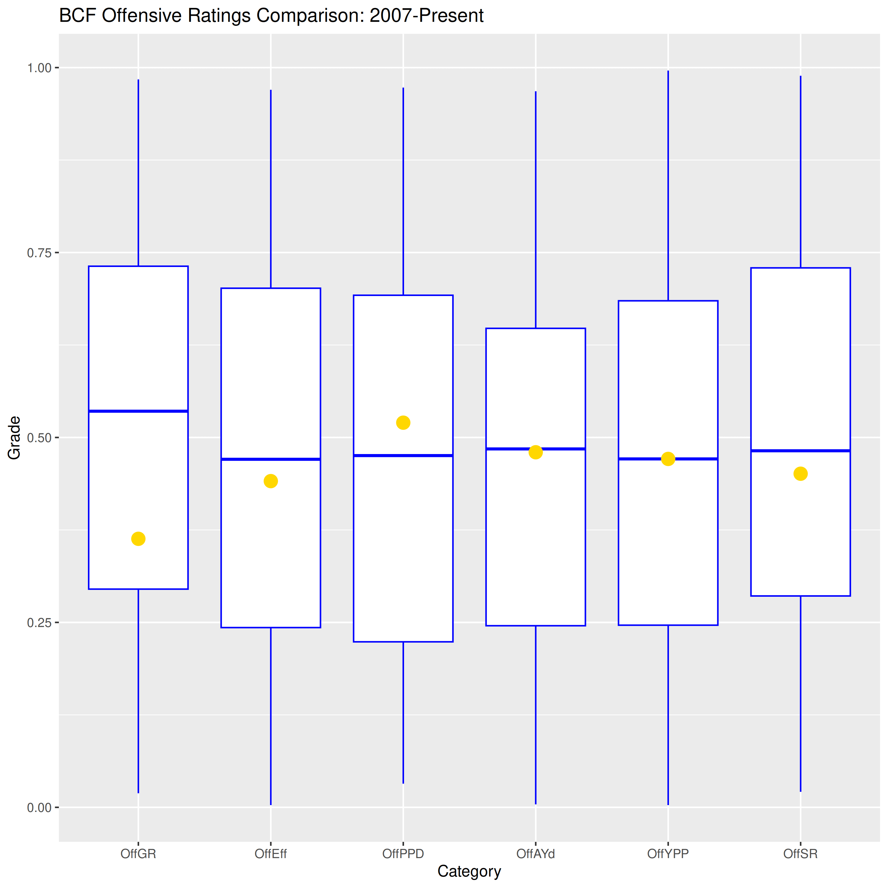
These are a bunch of new stats for this series, so let’s walk through them. Overall, they’re quite middling. The worst was Game Rating (OffGR), which captures an opponent-adjusted efficiency rating. The offense’s unadjusted efficiency (OffEff) was slightly worse than usual (i.e. just below the horizontal line). Compared to the Game Rating, this suggests that this UCLA team is a bit worse than Cal’s usual opponent (defensively, at least). Not great. Points per Drive (OffPPD) was slightly better than usual, while available yards (OffAYd) and yards per play (OffYPP) were exactly middling. This suggests that Cal could score the ball a little better than usual, but their ability to get the necessary yards to score the ball and the per-play efficiency were typical. Finally, success rate (OffSR), or the rate of ending a possession with a score, was slightly worse than usual.
Defense
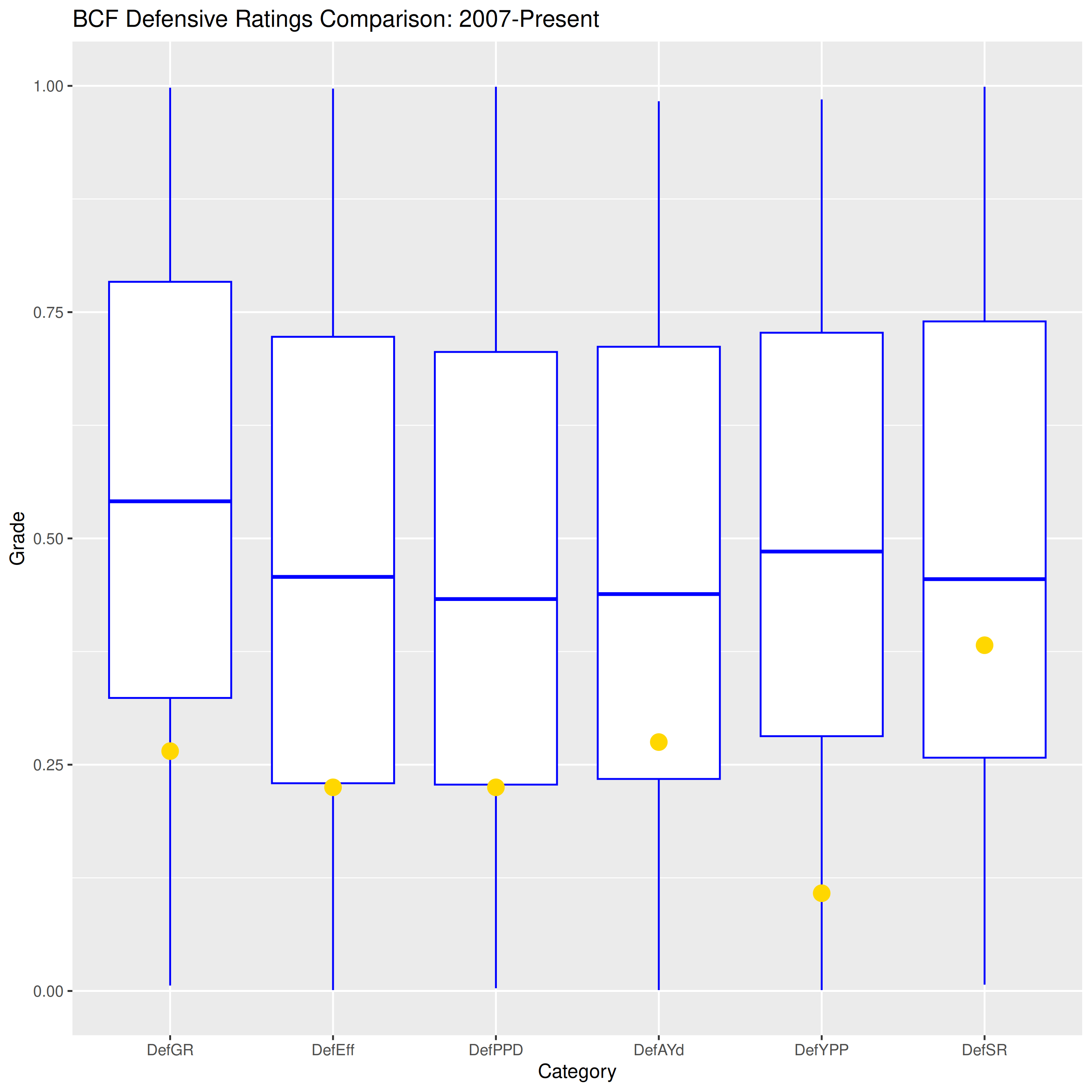
The ratings indicate this is a bottom-25 percentile performance for Cal’s defense. The only rating that is not terrible is success rate, which indicates that Cal did a not-awful job of stopping UCLA from scoring (this is because UCLA had several short possessions ending in punts and one ending in an interception). When UCLA did move the ball, they were both efficient and productive. If you’re wondering why points per drive (DefPPD) was around the 25th percentile while success rate (DefSR) fared better (success rate, or the rate of drives ending in a score, is closely related to points per drive), it’s because Cal allowed UCLA to score 6 TDs on their 7 total scoring drives. Had Cal held them to several more field goals, that success rate would have been the same while the points per drive would have fared better. As we grow accustomed to the new data source, it will be easier to tease apart those little nuances reflecting how the ratings of the game demonstrate variations across productivity, efficiency, and scoring.
Special Teams
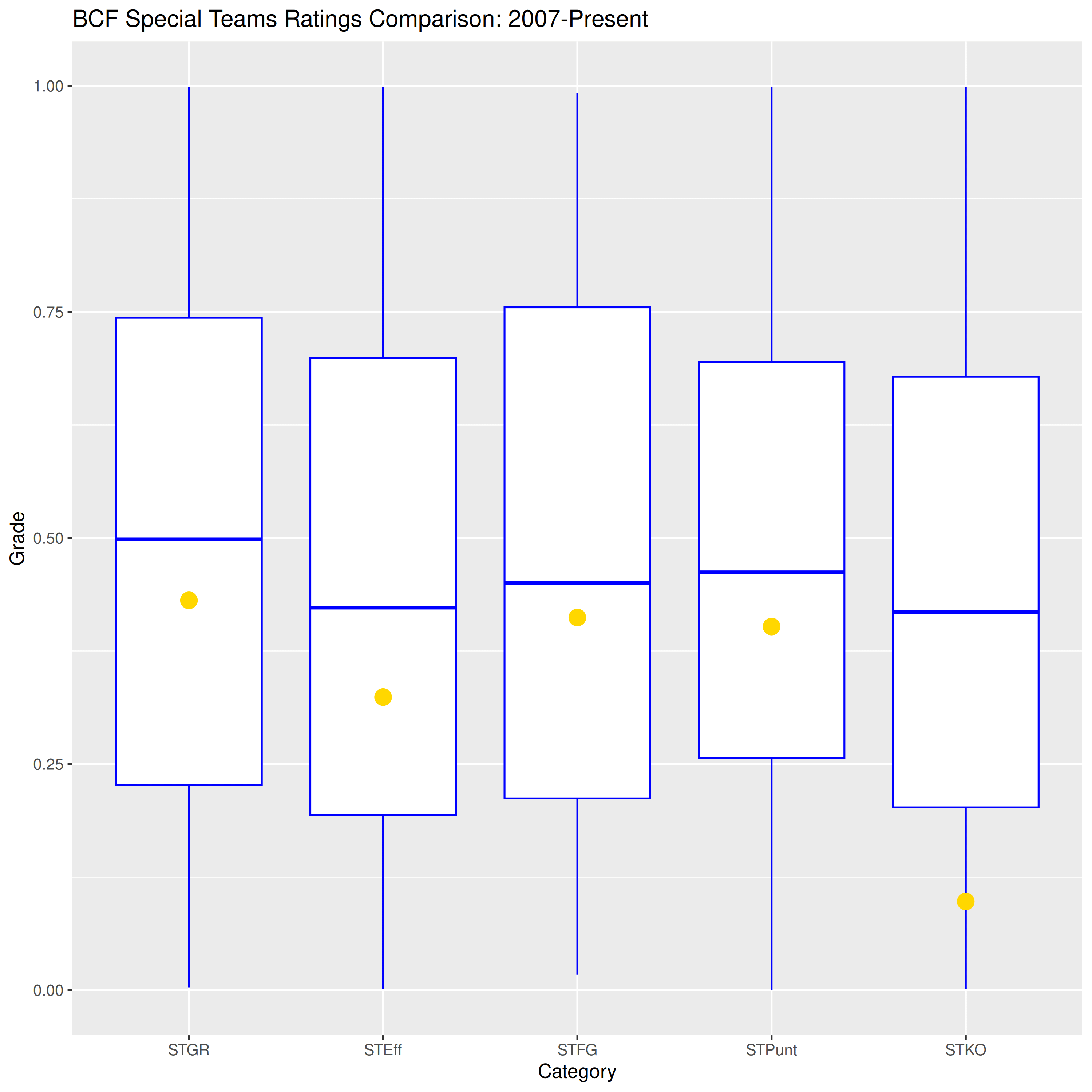
Overall, every category in special teams was slightly worse than usual. Except kickoffs, where Cal allowed 28 yards per attempt while the Bears failed to cross the 25 each time. As Nick constantly reminds us, just fair catch the ball.
Clustering
Now we feed our new data set into the clustering algorithm to see how it organizes the games. The clustering algorithm groups together games with similar sets of ratings and separates those with strong contrasts between their ratings. After tinkering with the algorithm a bit, I determined that four clusters was the best fit to our existing data (remember from our previous iterations of this series that the number of clusters can evolve over time, so we may see 3 or 5 clusters at some point in the future). So what kind of clusters did the algorithm return?
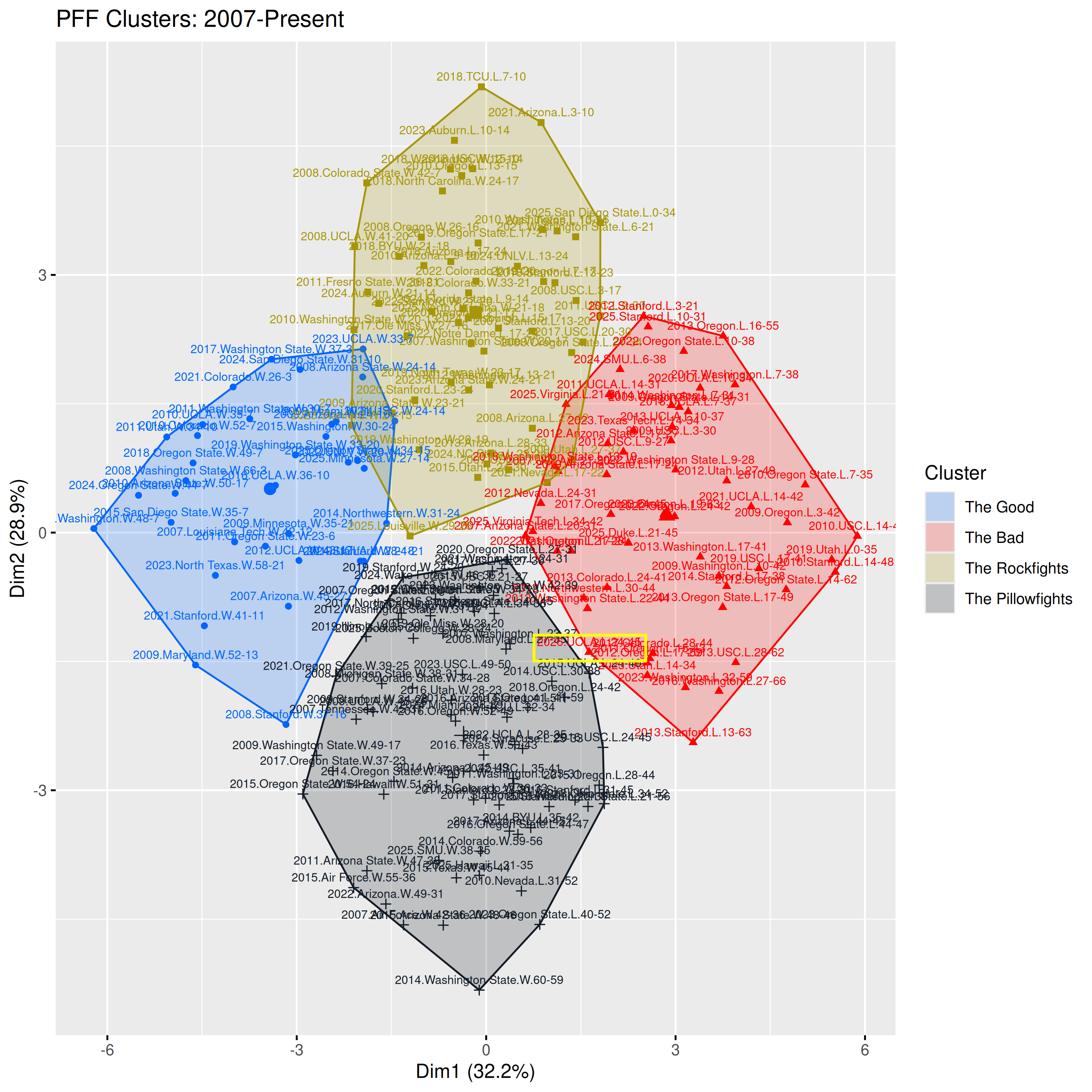
Good! Bad! Rockfights! Pillowfights! It’s a return to a familiar set of clusters we saw from 2023 through midway last season (the UCLA game fell into The Bad, but let’s not dwell on that). What kinds of ratings do we see in each of these clusters?
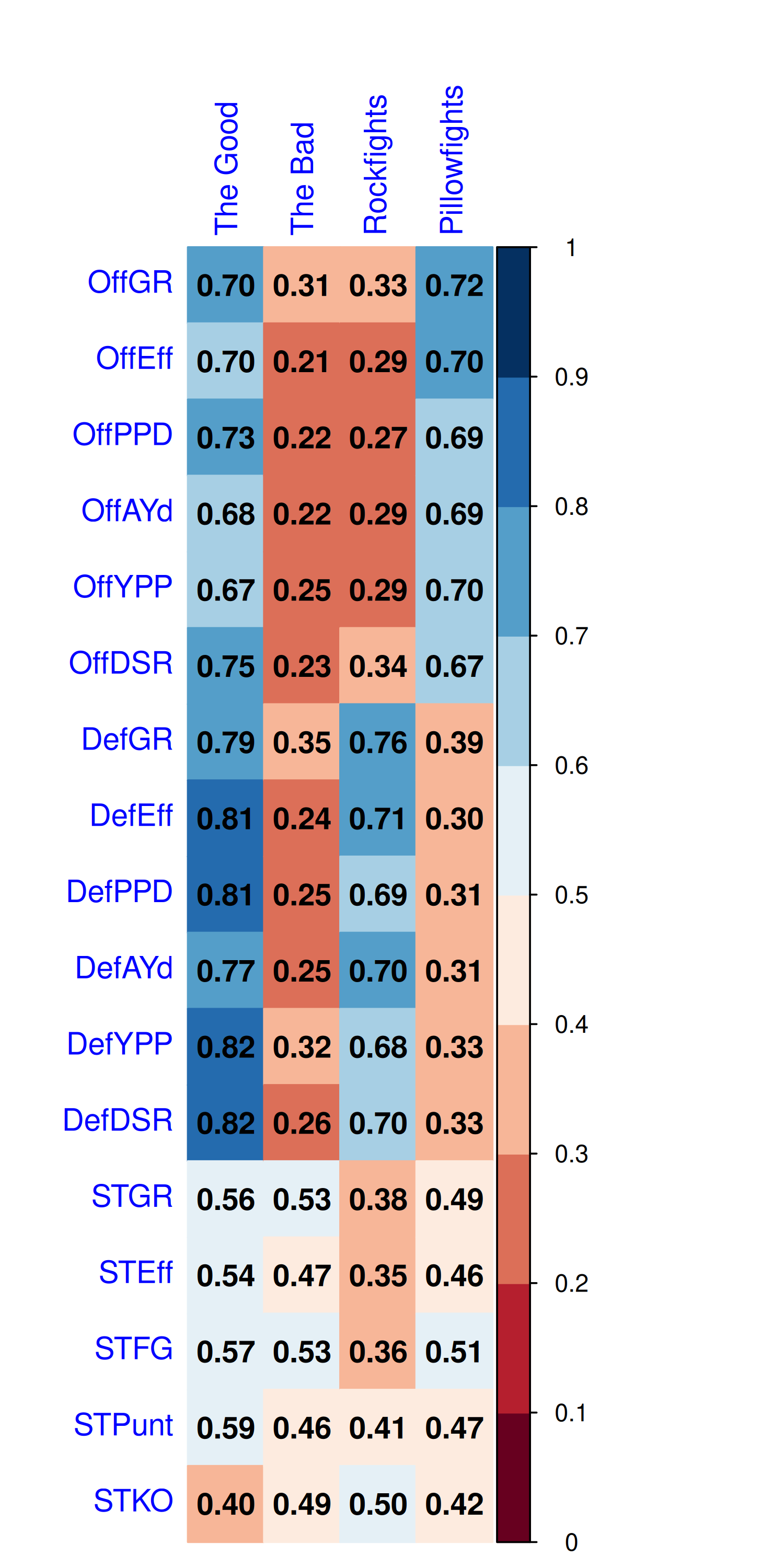
Good tends to earn strong scores across the board, while bad is awful in every direction. Rockfights feature great defense and woeful offense, while Pillowfights tend to turn into high-scoring shootouts. Although we have a new dataset, we have the same set of performance profiles we had seen throughout most of the Wilcox Era. I think that speaks well to the reliability of both PFF and BCF Toys’ data. We may have an entirely new set of data capturing drive-level measures, but we’re still largely capturing the same performance profiles across games.
The next plot shows how frequently each type of game occurred over time from 2007 through 2025.
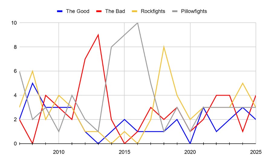
We see a mix of performance types in the later Tedford years, followed by a death spiral into The Bad in 2012-13, an explosion of Pillowfights during most of the Sonny Dykes years, and the rise and fall of Wilcox’s Rockfight teams. Then from 2021 onward the team had a mix of outcomes and was not clearly defined by any one type of performance.
The last two coaching changes brought a team with a clear identity, as evidenced by huge numbers of Pillowfights 2014-16 then Rockfights galore in 2018-19. Will the Lupoi Era follow a similar pattern? Or will it invent an entirely new category of games? When we originally began this series, the data were best defined by three clusters, but that grew to this same set of four in 2023, then expanded to 5 as the team found new and unusual performance profiles (and then expanded to 6 when I went back and added the Dykes-era data). I’ll periodically check to make whether four is the correct number of clusters or if we need to expand. But with 19 seasons of data baked in, it may be hard for a new cluster to emerge. In any case, we will find out as this 2026 season unfolds. Welcome back and Go Bears!
Good on you for discovering a solution to your data issue, which in this instant case may be an upgrade (dunno, only you can answer that). As a futures trader, give me less noise and more efficiency, which your solution has ?provided?
Cal really needs to get their shit in gear come Saturday. Let's agree that fUCLA with all the JMU coaches and players (playoff team) were more cohesive than Cal last week. OK, fine. That said the boys fought back and tied the game. All hell broke loose after that.
One player that flashed on defense, at least for me, was the King (Lopa). We need leaders to emerge, be vocal and demand excellence. Currently Cal doesn't have much of that on either side of the ball. Perhaps the King will step into that role.
Great analysis, and I'm glad you have a new data source that aligns with how you view the game stats. However, lost in the article was the fact that this was a BAD GAME for Cal. The OL flat out got owned by UCLA, and overall D play (except for Q3) was really not up to snuff - 277 rushing yards given up. The GBs have a lot to clean up, and after watching the WFC clips on the Syracuse QB, I'm very concerned for this Saturday. We can easily be 0-2, with the fan base saying "wait til next year" earlier than usual. Let's hope Tosh lit a fire under the team for this Saturday.… GO BEARS