PFF in Review: The Three Types of Cal Games Under Justin Wilcox
The good, the bad, and the rockfights.
Welcome to a new weekly series we’re starting at Write for California. After each game Pro Football Focus (PFF) grades the team across thirteen categories, such as pass protection, tackling, pass rush, and special teams. In this series we will compare the Bears’ most recent grades to their history of grades under Justin Wilcox. We are particularly interested in seeing which “type” of game it was. For example, under Sonny Dykes we seemed to have several types of games: the high-scoring shootouts, the occasional blowout win, and the unfortunately common blowout losses. As a primer for this forthcoming weekly series (starting next week), today we’re going to identify three common types of games under Justin Wilcox.
PFF Data
Before diving into the data, let’s review the thirteen team-level categories PFF grades:
OVER: Overall performance
OFF: Offense
PASS: QB passing
PBLK: Pass protection
RECV: Routes run by receivers
RUN: RB performance
RBLK: Blocking for the rushing attack
DEF: Overall defense
RDEF: Run defense
TACK: Tackling
PRSH: Pass rush
COV: Defensive coverage of receivers
SPEC: Special teams
Here’s a look at the Bears’ grades over the past five seasons.
2017:
2018:
2019:
2020:
2021:
Three types of games clearly stand out in that data, right? Maybe not. After five seasons of games under Justin Wilcox, we have a ton of data. We have too much data to make sense of it by looking at tables or plots of the raw data. Instead, we’re going to use machine learning to make sense of the data. To keep this article approachable and family-friendly, I’ll omit most of the gory details. But if you’re interested in the details of the machine learning algorithm I used for these analyses, you can read more about it in the Appendix.
Identifying Prototypical Games under Wilcox
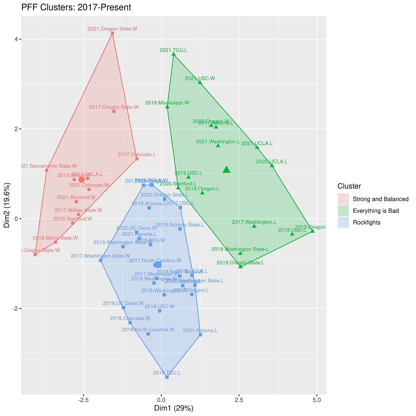
Because the data tables are too large and complicated to investigate manually, we’ll rely on machine learning to do that hard work of identifying clusters in the data. The clusters represent sets of games with similar PFF grades. We find three clusters in the data. After looking over the games in each cluster, we see that the clusters represent three types of games: strong and balanced games where the offense and defense excel, sub-par performances where the offense and defense experienced some struggles, and rockfights where the offense struggled and the defense excelled. I’ve plotted the clusters in the figure below. Each data point is labeled with the year, the opponent, and the win/loss outcome. Data points that are close together are similar games, while data points farther apart are quite different from each other.
(To peruse the data more easily, click the above image for a larger version).
In the above plot the strong and balanced cluster is red, the sub-par cluster is green, and the rockfight cluster is blue. Near the center of each cluster is a symbol representing the average position in that cluster. Games closest to that point are most representative of the cluster. Here are some of the typical representatives in each cluster:
Strong and Balanced: 2019 vs. Illinois (W, 35-20), 2021 vs. Colorado (W, 26-3) 2017 at UCLA (L, 27-30). In each of these games every category scores well in the 60s, 70s, or 80s.
Everything is Bad: 2018 vs. Oregon (L, 24-42), 2019 vs. USC (L, 17-41), 2020 at UCLA (L, 10-34). While not every category is terrible in this cluster, we see far more grades in the 40s and 50s than we see in the other clusters.
Rockfights: 2017 vs. North Carolina (W 35-30), 2017 vs. Ole Miss (W, 26-16), 2019 at Washington (W, 20-19). These games are often characterized by excellent defensive scores in the 60s and 70s and lousy offensive scores in the 50s.
Membership in these clusters extends beyond the typical games, however. The Rockfight cluster, for example, has several games you’d probably expect to be all-defense, no offense rockfights: the 2019 Lightning Bowl at Washington, the Cheez It Bowl, and the 15-14 win over USC in 2018. But it also has some games that aren’t low-scoring, defensive struggles: the 33-20 win over Wazzu in 2019, the 33-21 win over Colorado in 2018, and the 37-3 blowout win over Wazzu in 2017. So there is indeed some variation within each category.
Cluster Comparison
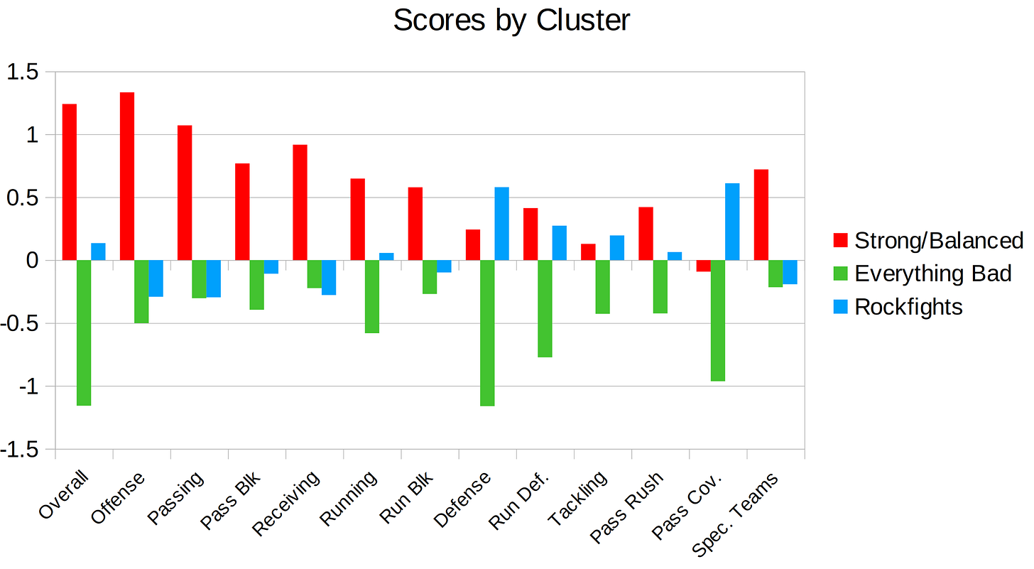
The figure below highlights how the grading categories differ across the three categories. Note: the data were rescaled for the machine learning algorithm, so the scores below aren’t on PFF’s usual 0-100 grading scale. Rather, it’s on a smaller scale where positive is better than usual, negative is worse than usual, and 0 is around average.
There’s only one cluster where the offense performs well: the Strong and Balanced cluster. Not only does offense score well, but every single category of offense is vastly better than in the other cluster. Nearly every aspect of offense scores poorly in the Rockfight cluster and those grades are typically even worse in the Everything is Bad cluster. Defense performs well in the Rockfight cluster and the Strong and Balanced cluster, although defense tends to be a little bit better in Rockfights. This is especially true for pass coverage; lockdown pass defense seems to be a key ingredient for a rockfight. Unsurprisingly, everything is bad in the Everything is Bad cluster: offense, defense special teams—all of it scores poorly, often by large margins compared to the other clusters.
Conclusion
We’ve found three types of games that characterize the Wilcox Era: the Good, the Bad, and the Rockfights. The Good has good offense and good defense; the Bad has bad offense and bad defense; and the Rockfights have bad offense and good defense. If you imagine this as a 2x2 square chart, then it looks like we’re missing data in the good offense, bad defense section. While that category would be full of games from the Sonny Dykes era (hmm…something to look into this offseason?), that bin is empty under Wilcox.
Now that we’ve identified the prototypical Wilcox games, each week from now on we’re going to look at the PFF grades from the most recent game, run the machine learning algorithm to figure out which cluster it belongs in, and highlight some similar games. See you next week!
Appendix
Our machine learning algorithm of choice for this application is the k-means clustering algorithm. The goal of the k-means clustering algorithm is to identify sets of clusters where data points in these clusters are much more similar to each other than they are to members of other clusters. Using a user-specificied number of clusters (the k in k-means), the algorithm starts by creating k subgroups and randomly assigning the starting positions of those clusters. It then begins an iterative process to determine cluster membership. Here’s how the iterative process works:
Starting with the first, randomly generated set of clusters, the algorithm uses all our categories (pass offense, pass blocking, run offense, run blocking, etc.) to calculate the central position in each. Each data point will then be assigned to whichever cluster has the closest center. Ideally, cluster members will have values close to their cluster center and large differences to the centers of other clusters. Now that the first round of cluster membership has been assigned, the algorithm calculates the new center points in each of the clusters, and assigns data points to the closest cluster center (some data points will probably change clusters during this step). Once the new cluster assignments are determined, the process repeats again: calculate the centers and assign data points to their closest centers. It repeats this over and over until data points stop changing cluster membership.
Through this iterative process the algorithm aims to minimize squared euclidean distances within groups by achieving the lowest total within-cluster sum of squares (in less technical terms, the total deviation of everyone from the cluster center) and maximize squared euclidean distances across groups (maximizing deviations across clusters). It uses this iterative process to churn through various cluster memberships until the best possible fit is achieved. Ideally, we will end up with a coherent set of distinct clusters. Cluster membership can be shaped by the randomly generated starting point, so we randomly generated 25 different starting points and the algorithm chose the best one after its iterative, cluster-validating process.
One of the primary challenges here is identifying the total number of clusters. The total number of clusters in a k-means ranges from 1 (entirely uninteresting, as everyone is in the same cluster) to the total number of data points (each data point would be in its own cluster--again, profoundly uninteresting). One strategy to identify the ideal number of clusters is to run the k-means clustering algorithm on a range of values (2 clusters, 3 clusters, 4 clusters, and so on) and calculate the within-cluster sum of squares for each clustering solution. The within-cluster sum of squares should decrease consistently as more clusters are introduced, but the rate of improvement will eventually start decreasing (for those familiar with calculus, it's like taking the second derivative of a function and identifying the point at which that second derivative transitions from negative to positive). Similarly, one could look at the amount of variance explained across different clustering solutions (1, 2, 3, etc.) and identify the point at which the rate of improvement markedly slows down. Identifying the optimal number of clusters can be a subjective process, and in some cases different statistics can suggest different number of clusters. Ideally, a variety of statistics will point to the same number of clusters. But that's not always the case. There are a number of different approaches for identifying the ideal number of clusters and I encourage anyone interested in reading further about it to peruse this wikipedia page for some example approaches (https://en.wikipedia.org/wiki/Determining_the_number_of_clusters_in_a_data_set).
Ultimately, it appeared that 3 clusters was optimal for our data. As we add additional data over time, this could change. But it seems unlikely given that we have five seasons of data already. It would take a distinct change how the team performs for a new cluster to emerge (for example, if we revert to a Sonny Dykesian all-offense, no-defense style of play). Nevertheless, I'll probe the data periodically to see if new clusters emerge or if the characteristics of these existing clusters change over time.


Strong and Balanced = 🟨 Gold
Rockfight = 🟦 Blue
Everything is Bad = 🟥 Red
If it's all the same to you, that would be my only suggestion for this otherwise outstanding analysis.
This may be way too much data/analysis (I'm an analyst by trade so...) but it would be cool to try to align the PFF grades with the post game fan ratings, see where the differences are because I think fan ratings are heavily influenced by expectations and theoretically the PFF grades aren't as much...